COLOR ME CRAZY PROJECT—Photoshop
 Using the instructions
provided in the example, create a poster design similar to
the one shown but using your personal photos. Use 3-5 photos—one that is
extremely close up and one that is waist up in a pose of some sort (the rest
are up to you, but vary the poses and angles). Feel free to dress up, wear
sunglasses, use props, etc., and express your personality! You may choose to
use your own colors and text for the project.
Using the instructions
provided in the example, create a poster design similar to
the one shown but using your personal photos. Use 3-5 photos—one that is
extremely close up and one that is waist up in a pose of some sort (the rest
are up to you, but vary the poses and angles). Feel free to dress up, wear
sunglasses, use props, etc., and express your personality! You may choose to
use your own colors and text for the project.
COLOR ME CRAZY EXAMPLE INSTRUCTIONS
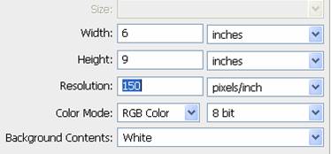 1. Create a new RGB document (File, New) and
set width to 6”, height to 9”, and 150 ppi resolution. Save as CMC_Rucker in your ps_lesson_4 folder.
1. Create a new RGB document (File, New) and
set width to 6”, height to 9”, and 150 ppi resolution. Save as CMC_Rucker in your ps_lesson_4 folder.
When creating your image, you will save it as CMC_Yourname.
2. On
background layer, select the Gradient tool (set foreground to color and
background to colors of your choice first) and draw a linear gradient across
the document.
3. Open
the images you are going to use (as separate documents). Remove the background
(as needed) for the images (extreme close-ups may not require any special
selection). Use the Move tool to drag the selections into the CMC project file.
They will create their own new layers.
4. Once moved, use the Move tool or Transform
tool (press Command-T to change the Command bar to the transform tool) to
position/scale the images.
5. Click
the eye icons to turn off visibility of the image layers.
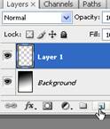 6. Click
the background layer and then click the Create a New Layer icon to place a
blank layer above the background layer.
6. Click
the background layer and then click the Create a New Layer icon to place a
blank layer above the background layer.
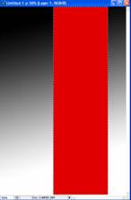
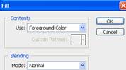 7. With the new layer active (probably will
be Layer 3), choose the Rectangular Marquee tool and draw a selection from the
top to the bottom of the document. You will edit it later. Choose a color and
then click Edit, Fill (or Shift+F5) to fill the marquee area with color.
7. With the new layer active (probably will
be Layer 3), choose the Rectangular Marquee tool and draw a selection from the
top to the bottom of the document. You will edit it later. Choose a color and
then click Edit, Fill (or Shift+F5) to fill the marquee area with color.
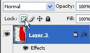
 8. Next up, add a layer style (bottom of
Layers panel—fx) and choose Stroke. Set the color white, position to outside,
and size as you see fit (5 px+ works pretty good). You should see a nice little
white border around the marquee area.
8. Next up, add a layer style (bottom of
Layers panel—fx) and choose Stroke. Set the color white, position to outside,
and size as you see fit (5 px+ works pretty good). You should see a nice little
white border around the marquee area.
9. Press Command+T to bring up the transform Commands. Position as needed (you can
always move it later, though). Click the skew button to add curves or change
the location of points (play with this a bit.. it’s fun). The skew button is by
the “cancel” button (and the checkmark up there). When you get it positioned,
be sure to press the check to go on. 
10. Command+D to deselect the marquee area and get on with your life. J
11. Now
the fun…desaturate the first photo and create a clipping mask. How you ask?
Make the first photo layer active (click it, Layer 1) and click it’s eye icon
to restore visibility. Press Shift+Command+U to remove the color information (it should go grayscale when
you do!).
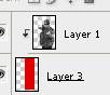 12. Next,
hold the Alt key and point between the layers (the picture and the shape) and
look for a little “lock” looking icon to appear. Click. Notice that the first
layer will “point” to the layer below it to show that a clipping mask is applied.
12. Next,
hold the Alt key and point between the layers (the picture and the shape) and
look for a little “lock” looking icon to appear. Click. Notice that the first
layer will “point” to the layer below it to show that a clipping mask is applied.
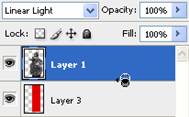
13. Now,
click on the image layer and set the blending mode (as shown in the graphic
above) to Linear Light. Check out that effect! (NOTE: Try using a blending mode
of Linear Light before you do a clipping path to give you other ideas about how
you can use Linear Light…fun times!).
14. Increase
the contrast of the picture. Press Command+L to bring up the Levels adjustment.
Play with the sliders until you get the look you want.
 15. Repeat this process for the rest of your
photos (make a new layer for each shape). Experiment with different
shapes/warp, shape colors, etc. You can “cheat” and make a copy of the shape layer
(Command+J on the layer) and then just change the fill and shape! BUT WAIT!!! DO NOT CHANGE THE FILL
COLOR UNTIL YOU LOCK TRANSPARENT PIXELS—it’s in the Layers panel under the
blending mode. J Then, reposition using the move/warp tools.
15. Repeat this process for the rest of your
photos (make a new layer for each shape). Experiment with different
shapes/warp, shape colors, etc. You can “cheat” and make a copy of the shape layer
(Command+J on the layer) and then just change the fill and shape! BUT WAIT!!! DO NOT CHANGE THE FILL
COLOR UNTIL YOU LOCK TRANSPARENT PIXELS—it’s in the Layers panel under the
blending mode. J Then, reposition using the move/warp tools.
16. To
finish off the design, add some text. Just a few notes on text—
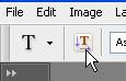
a. Click
the Type tool and then click and drag to draw a text box; make it big enough to
fit (you’re probably going to want to use a pretty big font!)
b. Add
Layer styles to the type layer to get it to look cool (Layer, Layer Styles…)
such as shadows, glows, bevels, gradient fill… you get the picture.
c. Under
Window, Character you can bring up a settings box for text to scale/stretch,
etc.
 d. For vertical text, click the Text
Orientation button up on the Command panel.
d. For vertical text, click the Text
Orientation button up on the Command panel.
Requirement
|
Points Possible
|
Deductions
|
Set new
image size to 6” for width and 9” for height; resolution should be 150 ppi
(Save as CMC_Rucker.psd or CMC_Yourname)
|
5 |
|
Gradient is
used for background; portions remain visible at project completion to
demonstrate gradient was used
|
5 |
|
At least
three personal images are used; selections are clean and precise (zoom in
closely!!)
|
10 |
|
Selection of
images (varying poses and angles)
|
10 |
|
At least
three shapes are used as clipping paths with images; shapes are transformed
with warp tool
|
10 |
|
Shapes
include a white stroke
|
5 |
|
Photos are
desaturated and linear light applied for color effects (each shape may use a
different color fill or the same; it’s up to you)
|
10 |
|
Levels/contrast
are modified to increase overall sinister tone of project
|
5 |
|
Text is
added to image and includes at least THREE of the special layer effects, such
as satin, bevel, drop shadow, glow, etc.
WRITE BELOW WHAT YOU USED:
|
9 |
Must fill out
or half points
|
Overall
quality of project
|
6 |
|
Project
printed in color and attached to scoring guide
|
5 |
|
CALL TEACHER
OVER TO SIGN THIS BOX—it is for points!
Layers are verified (to show clipping paths)
or teacher will mark off. |
5 |
Be sure to
get teacher verification
|
Questions (see below)
|
20
|
|
TOTAL
|
105
|
|